One fascination I and many friends seem to have is aeronautical charts, especially old ones. If you look closely at a sectional from, say, the 1960s, you’ll immediately notice that they’ve gotten more complicated over the years. That’s an inevitable outcome from more airplanes and people flying in comparison. Cities and towns have grown, highways built, etc. Another thing you might notice is that the basic colors and symbols used back then are still employed today. There’s a lot less magenta and more blue, denoting airspace changes, plus a few more symbols and a lot more text. All of which are ways in which charting has evolved over the last 50 years.
The biggest change in charting, of course, has been the shift from paper to pixels. As a renter, I used to carry around a huge briefcase to organize the instrument and visual charts I needed for my normal stomping grounds. Today, of course, I can have charts for every airport in the world on a cell phone. I can search for everything I might need with a couple of taps instead of reaching into the back seat for something I left in the car. They’re geo-referenced to show me where I am on the map, and I can zoom in and use night mode, among other useful features.
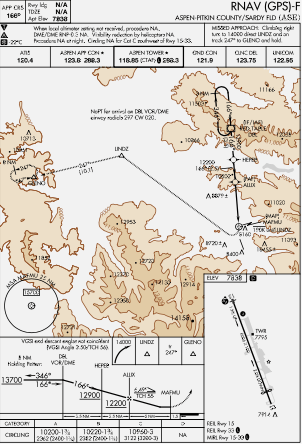
But terminal procedures charts—arrivals, approaches, departures and airport diagrams—haven’t progressed beyond the moving map. A printed page was digitized, but the basic format hasn’t changed, remaining a static, two-dimensional image. Meanwhile, the displays we use offer many more options than just black and white. Which is a great example: Why not use color the same way it’s used on sectionals to emphasize various features? Yes, color already is used on some approach plates to depict high terrain, like around Aspen, Colo., as shown in the image here. Maybe use color to highlight other information? Automate notes, terminal routings and DA/MDA selection? Add more pages?
The obstacle departure procedure is another area where charting could be improved, because there basically isn’t any ODP charting. Instead, we’re left to poke around in the nether regions of our EFB or other reference to learn we must, for example, circle over the airport, then fly in the opposite direction to our route of flight before reaching a navaid or fix from which we can proceed to our destination. And there’s no chart for that, only a textual description.
Terminal procedures don’t have to be static or monochromatic. They can become even more useful, with more information covering more procedures. They might even get less cluttered.
Yes, I realize all this would have to be standardized in meetings consuming thousands of person-hours and involving all the industry players. But it’s time to think about documenting terminal procedures with the same kinds of digital magic we enjoy elsewhere.
— Jeb Burnside


