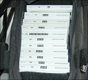
Although Ive been accused of having Luddite tendencies, Im usually open to trying new things and doing old things differently. That said, a few years ago, I regularly ranted about proliferating portable electronic devices (PEDs) in the cockpit, usually focusing on the maze of power and data cables required. “A safety 288 hazard,” I pointed out to anyone who would listen. I got over it, and my cockpit these days has at least two PEDs: a Garmin portable to display datalinked weather information and either my cellphone or an iPod to play music over the intercom, plus the cables to go with them. I also had a third device at the ready to display approach charts. I only dragged it out when needed, still clinging to paper, especially for my en route charts. My transition from all-paper to some-electronic charting continues and I probably wont go paperless anytime in the near future-at least not before my existing subscriptions expire. Some of the concerns I have about going all-electronic in the cockpit are summed up in Dave Higdons cover article this month on getting to know your new electronic flight bag (EFB): Ive been around computers enough to know their foibles and sincerely dont want to get caught with my chart-pants down. Ill eventually get over it this, too. But the other thing really bugging me about electronic charts in the cockpit is this: Were using all this spiffy technology to display something-a map-essentially unchanged since its invention. Isnt it also time to take advantage of the hardware platform and improve the chart technology, too? Terminal procedures are a great example: After decades of lugging around reams of paper, were displaying those same approach plates on a screen. But we havent begun to take advantage of the platforms capabilities and re-think whether the paper-based charting format weve moved to the new platform is the best we can do. I suggest it isnt. Off the top of my head, I can think of several things Id like to see on an approach plate displayed electronically in the cockpit: Geo-referencing, for one (which is already available on some platforms, and coming to others), better use of color, some kind of interactive approach briefing capability, a pre-approach checklist and an interactive way to compute missed-approach performance come to mind. Basically, Im looking for a better way to emphasize stuff that can kill me when flying a specific procedure. Such a product can be a supplement to the existing charting formats rather than a replacement. Of course, no one is going to tackle this kind of project by themselves-the liability exposure is much too sobering. Instead, its time for the FAA and other organizations like ICAO and EASA to get together and start thinking about charting 2.0. Im in. – Jeb Burnside


