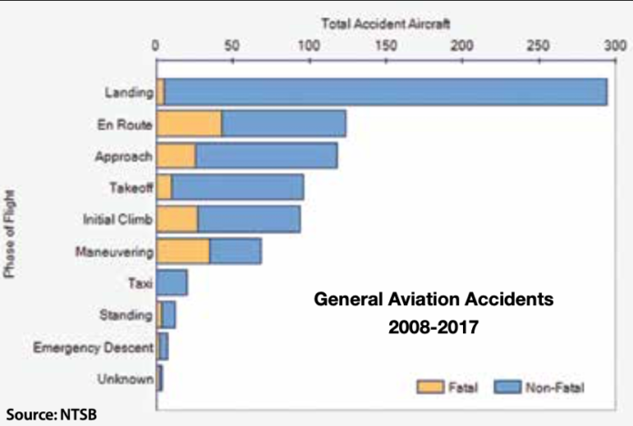
The NTSB recently updated its rolling 10-year look-back infographics to reflect data from CY 2017, including the bar chart at right. This graphic compares the phases of flight in which personal-flying accidents occurred over the period, and shows maneuvering accidents are fatal roughly half the time.
© 2025 Firecrown. All rights reserved.


Another government chart, with varying data, points to one undisputed truth about pilot performance.. A mostly aging pilot population, with a penchant for “not flying..!” Typical pilots today derive more pleasure from knowing they own an airplane, rather then when actually flying in one.. The insurance companies know this and can use ADS Data to track a specific N-number, and see first hand how much pilots are not honing their skills.. Hence, the mysterious “Risk Premium” hikes that are met in disbelief by those holding such a policy..